My Own Way Back Machine

I was cleaning my backup hard drives today and started to find old projects from college and high school. Amongst the heap I found a file titled "version 1.0". Inside was a website directory so I went ahead and opened index.html. I was instantly transported back to 2005.

Side note: I've put all the sites up on a server so the links on the photo of each site is live. V1's source code is especially interesting to look at seeing as to what it was spit out of...


V1

It all started with my first personal website... And it was built with iWeb.

iWeb was a WYSIWYG website creation tool that was introduced in iLife '06 and lived a long and healthy life until Apple killed it alongside the MobileMe transition to iCloud in 2012. It generated downright awful code in the background but allowed the user to drag and drop elements in a fashion similar to Pages or Numbers. This was at a time where Dreamweaver was the tool of choice that I was being taught how to build HTML with in college. Dreamweaver was still more work (and often awkwardly freaked out when attempting drag and drop interactivity with what you were building). So in stepped iWeb and what I can't believe I'm actually going to share publicly. Again.

It was aptly titled What's Crackalatin?

My Own Way Back Machine - V1

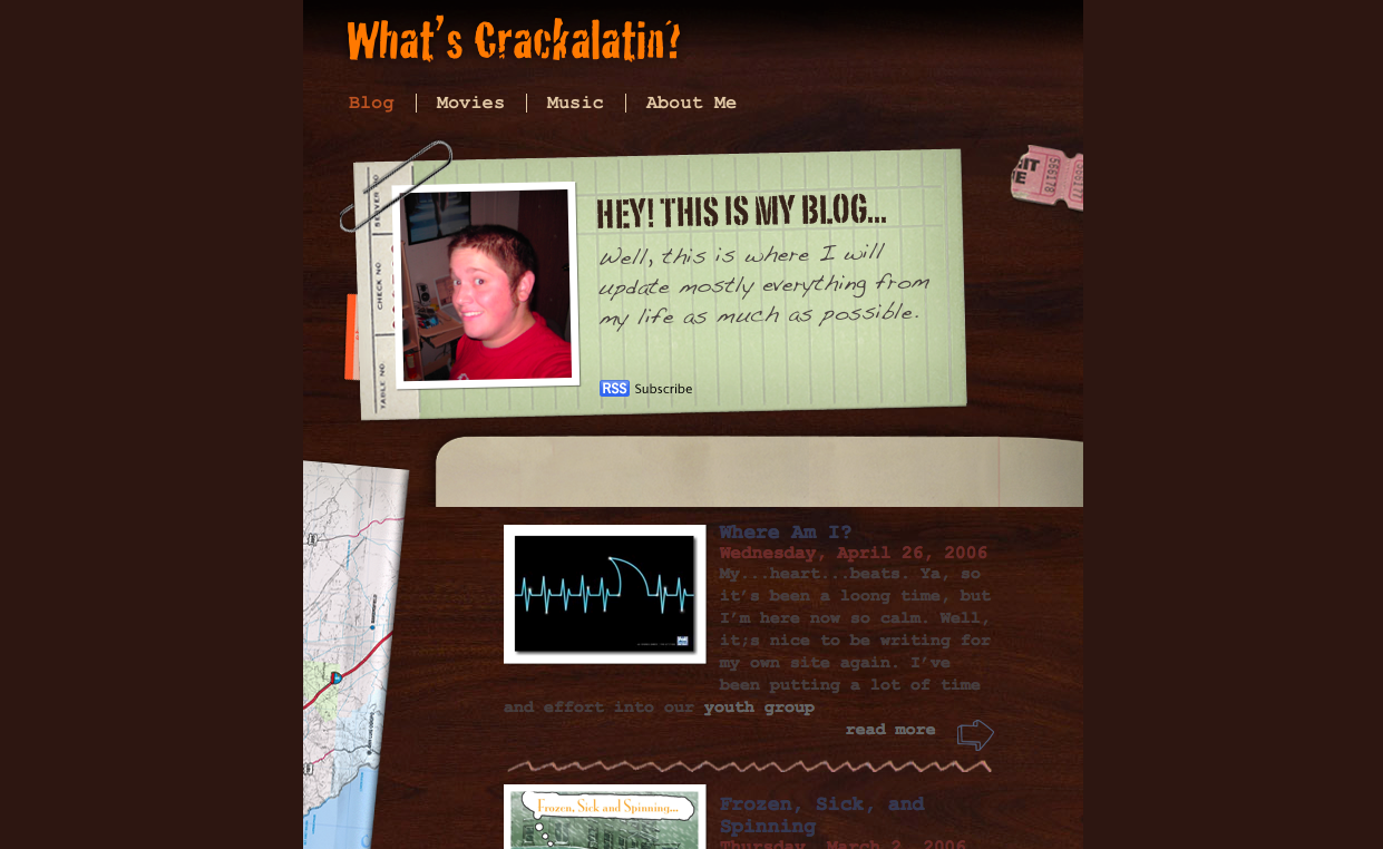
It physically ails me to look at this site today. While it encapsulates me from age 17 to 18 and that brings back some fond memories; the design is like having hot knives pierce my eyeballs. The content isn't any better. I used to treat my blog as a diary that I left open on the internet. Such a bleeding heart of teenage emotion here. You can also check out the mohawk I used to rock that nearly cost me the ability to graduate high school. I'll leave it to you to find that easter egg.


V2

By the time I put V2 together I had about a year of college under my belt. I started college with a focus on networking and communications but quickly found myself confused and bored learning about IP addressing and the binary calculations involved in the process. I wanted color and animations and code! I needed something that would engage me in a way that made college enjoyable so I switched majors to Multimedia Design and Development in between semester one and semseter two. I was learning Flash, HTML 4, CSS and graphic design. It was awesome. I knew that my current site was garbage and I could now build something from scratch by writing my own code. Thus, version two of What's Crackalatin? was born.

My Own Way Back Machine - V2

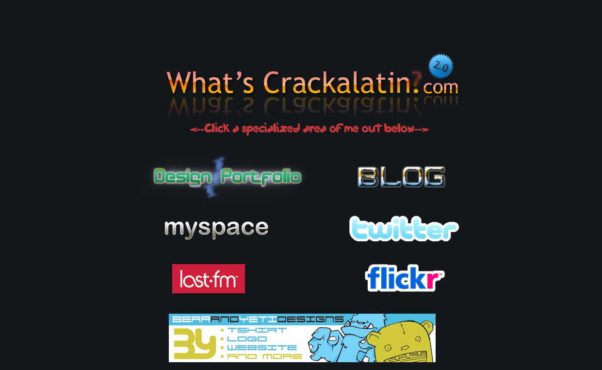
The design is comprised of multiple images acting as links and arranged in a table. There's even a banner for the long defunct Bear and Yeti Designs that my pal Dave Shepherd and I ran for about 2 years while in college. While I have backups of the blogs throughout time, I don't have backups of the WordPress databases so sadly my old blogs that ran on Wordpress are going to stay buried (for the time being). The design on this site is simplistic and painfully scattered. I used to think that every graphic deserved to have it's own font (which is a terrible decision). My portfolio from that time is also linked here and is a kick back to when I was involved with projects such as this awful, awful website that still stands as an example of archaic and terrible design. Every single site I built back then is dead and gone. Huge loss...


V3 (Beta)

Version 2 of my personal site may have lasted the longest of all designs thus far. For roughly four years version 2 represented my personal braaaannnd online. That's just sad. To call what follows here version 3 is really a cop out. It's an image I created with a link to my about.me page. This was the only thing that resided at dabigc.com for nearly a year. Such procrastination.

My Own Way Back Machine - V3

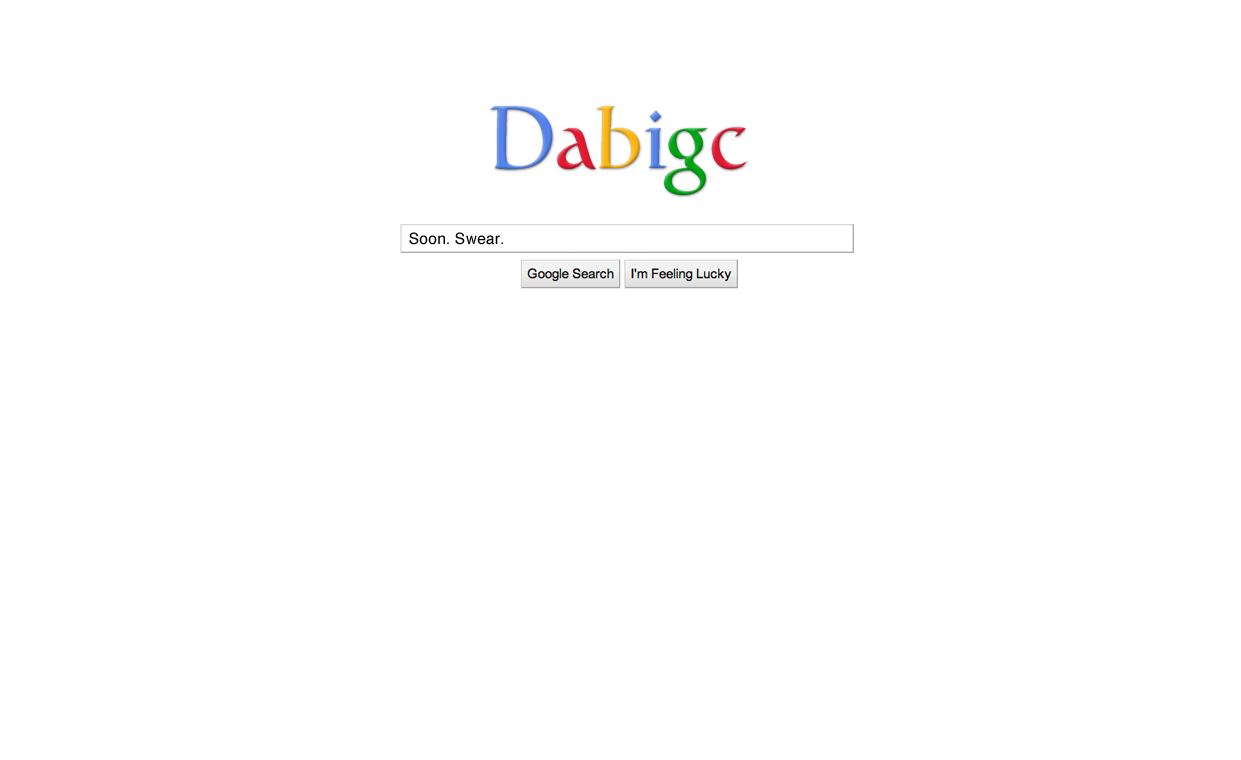
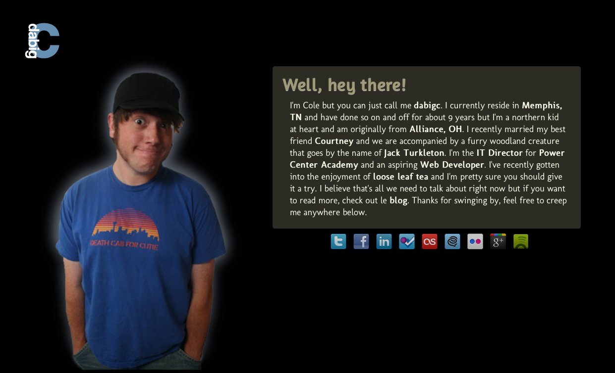
I decided in 2010 to dump the inscrutable What's Crackalatin? slogo (yes, I just said slogo) and just use the "pseudonym" of my most common username online. My new site would live at dabigc.com and would eventually be way better than that junk I'd previously made. I thought that the whole idea of using a pseudonym was slick and that it would get people to search for me by using my psedonym instead of my name. Why? Why would any sane person want to break away from their own name? Because of Cole "The Polar Bear" Konrad. That's why. Searching for Cole Conrad on Google has consistently provided results of this guy and asked if you want to see results for Cole Conrad, like so. I live in the Polar Bear's shadow and used to think that I could circumvent this by using dabigc as my individualization. So many bad decisions. I decided to put up a placeholder site with a tongue-in-cheek nod to the whole thought process above.


V4

When I finally got around to putting version 4 together I was really looking to create what I wanted my about.me page to look like (and they still look about the same as of this writing).

My Own Way Back Machine - V4

I used a CSS box with rounded corners and the opacity turned down to stuff a blurb about me into. Outside of that I used some social media buttons to link outward to services I used and a jQuery backstretch javascript to ensure that the left aligned background image of me in all my alternative (read: hipster) glory would resize to the window. I felt much better about what I'd built here as my whole intention at this point was to control what people would find if they looked for me online. It was simple and to the point, much like an about.me page and that's all I wanted.


V5

I decided I wanted to start focusing on writing online and having that be the first thing that came up when I started to get the itch to change the website up again. So I began working on version 5 which is what you see currently when navigating to dabigc.com.

My Own Way Back Machine - V5

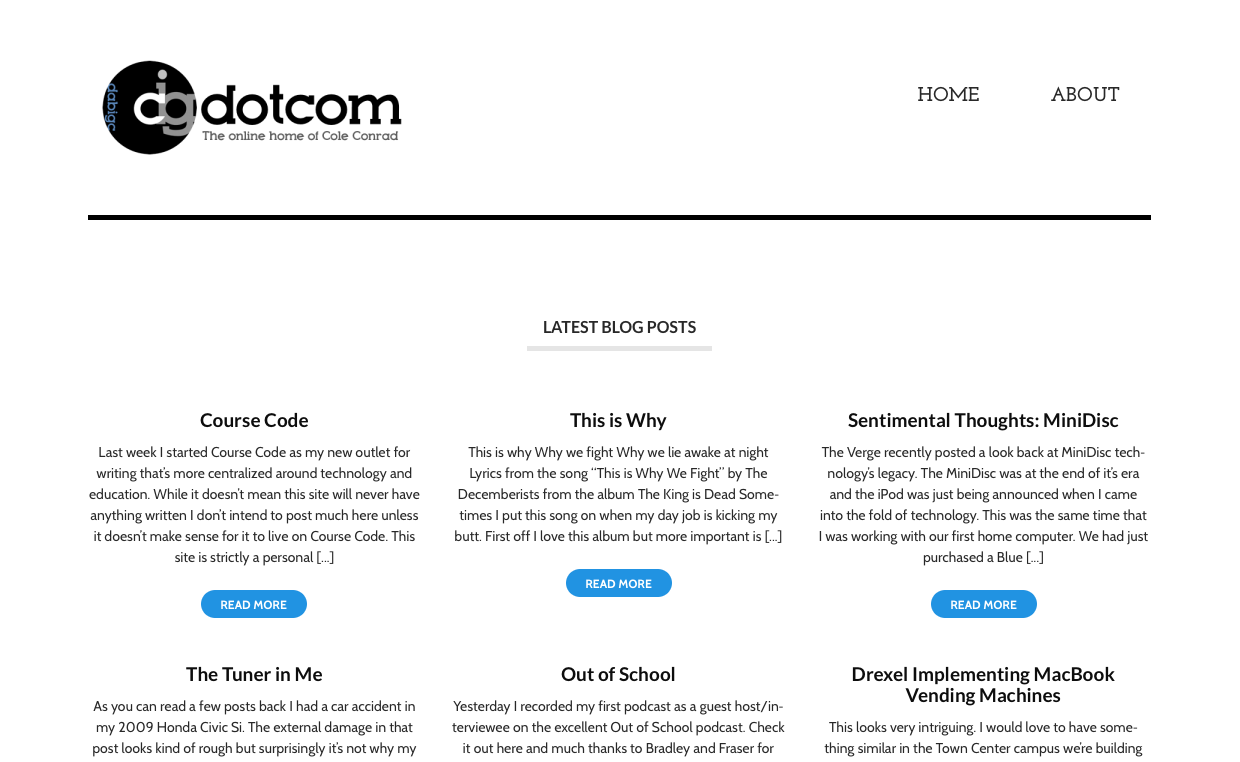
It had been two years that my site had sat silent, looking like an about.me page and I wanted to force myself to start writing more and have that be the focus of what you first saw when to went looking for me online. I thought about building my own theme for Wordpress and the mere idea overwhelmed me. So I took the easy (and much traveled) way out. I visited what I believe to be one of the better Wordpress theme sites out there, WooThemes, to find something that I liked. I landed on Hustle and then created what's currently the logo for the site. The logo has all five letters of dabigc in it with a focus on the "c" since I'm the "c" behind the site. It really has no other aim than to reinforce the site's name but it doesn't make me nauseous like a lot of my older design work. I finalized the site while I was on this trip. I did it all from my iPad mini on the bus ride back from Passion 2013. I still remember Josh Maze asking me what I was doing as it wasn't easy to manipulate the Wordpress backend and an FTP client on a 7.9" touch display.


V6

While version 5 of my site definitely looks the best thus far, the site's naming had long been an awful choice and was honestly only slightly less embarassing than telling people my website resided at whatscrackalatin.com. So I started thinking about writing something that was more focused on what I was immersed in at the time; technology's role in education. Thus version 6 of my site came to be and Course Code was born.

My Own Way Back Machine - V6

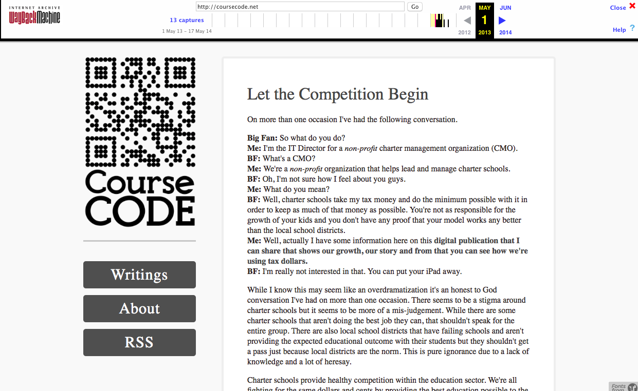
I started going through different names on Hover as it would be pointless to re-brand to a difficult domain name since that was my primary reason for re-branding in the first place. I was blown away when I found coursecode.net was available. It seemed like a mistake that somebody hadn't already grabbed the name but there it was. I jumped all over it. Once I had the domain name I sat on it for a few weeks as I waffled on what the site should look like and if I would stick with Wordpress as the backend for the site. I decided to give Squarespace a try to avoid getting my hands dirty as I knew that I'd get distracted messing around with code if I didn't. My aim was to write. That's it. I wasn't going to screw with the look of the site and end up miles away from my original intent. So I started with the Amelie theme and adjusted it to my liking. I also slapped together what may be the laziest approach to a "logo" that you can create. I made a QR code that pointed to coursecode.net and slapped it above the name in the sidebar. To be fair, I rushed to put the final touches on Course Code a few nights before recording an episode of Out of School with Bradley Chambers. Casper Focus had just been announced and I wanted to write about it before the upcoming recording so I slapped things together in a rush to make that happen. I started to write fairly often and then the inevitable happened. The writing well dried up and I was back to a post here and there. This lead to version 7.


V7

I took the feedback of a few friends and my own self-awareness of how bad the QR Code looked and decided to make Course Code look more like what I wanted it to. Simple, focused on the content and easily readable. I'd had Gabe Weatherhead's post on MacDrifter about his redesign for speed and legibility in my head for months before I touched Course Code's design again and it heavily influenced the approach I've taken with the current look of the site. I'm using pretty large text (20px) and bold Sans-Serif fonts that are easily readable and put the words and images front and center. No sidebars, simple navigation and plenty of posts before you have to click through to the next page of content. Gone is the QR Code (hallelujah!). Instead, the header let's you know that you're reading Course Code and nothing more. I'm content with the look of the site as it stands. We'll see how long that lasts.


The importance of the Internet Archive

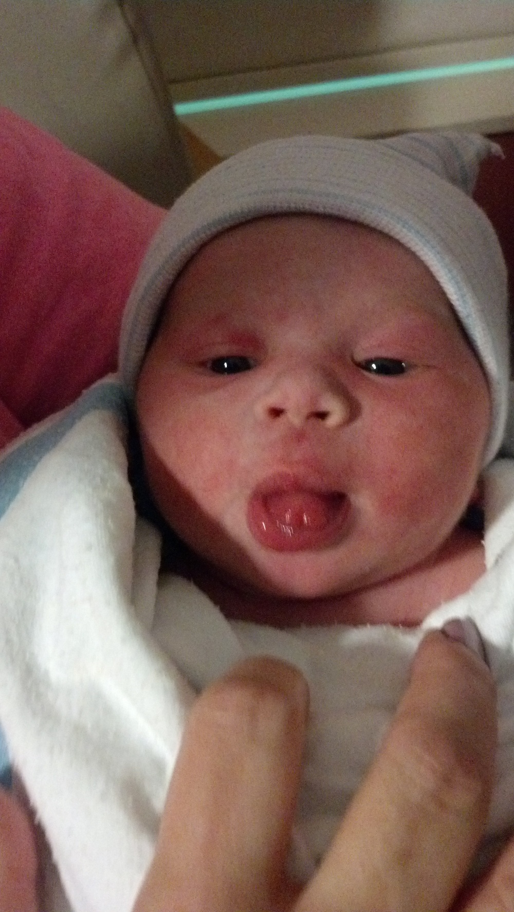
Even if it's horrifying when looking back at where my taste and direction were scattered at certain points along the way, the progression I've had since first becoming interested in web design back in high school has been really satisfying. There are fond memories tied to every revision of the site and what prompted me to invest the time I have into the part of my online presence I own. I'm lucky to have found the backups I did but there were pieces that were missing. Luckily I was able to piece them together using archive.org's Way Back Machine. It made me realize the value of what they're doing and how important it is to have an archive of the history of the internet as it ages. When I listened to episode 98 of CMD+Space a few months back I heard Andy Baio talking about the importance of the archive.org's work but I didn't really comprehend it. I'd be truly saddened if I had no way to pull up the work I've put online in the past and share it with my son one day. As the internet continues to become a bigger part of how people represent themselves it will hold more of who they are and eventually who they were. The work that the archive.org team is doing is complicated and has to adapt to the new technologies that are yet to come in order to preserve the full spectrum of what we create online. For those reasons I recommend getting involved or donating to archive.org to help keep the Way Back Machine alive and advancing alongside the market.

I can't believe I've been online with my own space for nearly a decade now. I can't imagine where things will go from here. All I can hope for is that my taste will continue to evolve and that I'll continue to contribute in my own small ways.

Independence Day

Big week.

It's a great day to hang out by the pool with friends and family and enjoy some homemade food. That's what I'll be doing today. It'll be a fantastic close to what will hopefully be a milestone week in our family's life.

As of this week I'm going independent with my career.

I've long held a small number of clients and provided technical consulting and support for organizations that can't justify a full time staff member. I'm going to expand that work, dedicate more time to writing here, and start learning how to develop software in order to bring some of the ideas I have to market. There'll be plenty more to share about going independent as I start to walk this risky tightrope and learn how to balance it. I may fall but I'm confident that I'll be able to sustain it.

I couldn't even think of taking this step without Courtney's amazing support and belief in me and all the encouragement that friends of mine have given me over the last 6 months or so as I've started to seriously consider this path. If you read this site right now, you're part of a very small handful of people and I thank you for your support. I can't wait to share more and see what's to come.

Audio Hijack Pro, Instant On & 10.10 Developer Preview

Audio Hijack Pro’s Warning to 10.10 Beta Users

Update: In the hours I've been using my Mac since I implemented this fix my machine has been running so much better. The Instant-On plug-in must be so deeply integrated with core pieces of OS X that it makes a dramatic difference in the way the system runs if the plug-in isn't yet supported.

If you're running the developer preview of OS X Yosemite and

  • Your Mac's audio isn't working
  • Audio Hijack Pro is installed
  • The Instant On plug-in is installed

The Instant On plug-in is most likely the culprit of your audio issues. I know this was the issue for me.

To fix the issue you'll need to remove the plug-in located at

/Library/Audio/Plug-Ins/HAL/

Your audio should start working immediately after trashing the file.

Solar Freakin' Roadways

The possibility of solar roadways seems awesome after watching this video. The idea of roadways providing fiber connectivity and bringing fiber optic speeds anywhere roads run makes me giddy with joy (maybe too much). The ideas presented seem like solar roadways are a no brainer. With the exceptions of cyberterrorism to change the LEDs on the road (Die Hard: With A Vengeance anyone?) and cost, I don't see anything but possibilities here. Unfortunately there is likely to be staunch opposition by those who stand to lose a lot of money in the existing roadway construction industry. Personally, I'd love to see this technology become mainstream.

Tennessee to Delay PARCC Assessments

I'm with Commissioner Huffman on this decision by the state. Delaying the PARCC assessment and putting the state assessment out to bid can only hurt our students in the long run. It seems that the general response I hear from a lot of school districts is drowning out what should be heard. Our kids can handle a push to comprehend more, to work harder and to be held to a higher standard.

So can we.

PARCC requires technology upgrades for most traditional schools as the test is administered digitally. This means implementing wireless and relatively modern technology that can accomodate many students testing at the same time. I have a huge concern when I'm in a training and I hear grumbling from administrators because of the amount of work that will have to go into accomodating the PARCC assessments. I go into a rage when those grumbles become vocal opposition to the assessments because "kids can't comprehend how to use technology and it's unfair to expect them to do so in order to take a test". This kind of thinking is absurd. The modern employment landscape requires basic comprehension of a mouse, keyboard or touch interface in order to attain a job. What I hear is the adults not wanting to put in the hard work required to prepare for the PARCC assessment.

Common Core and the PARCC assessment is a critical part of what's necessary to compete on a global scale. Having a nationwide standard that asks more of our students and gives baseline results across the country is the best way forward. This decision is truly disheartening.

Hello!

Hello from Riley!

I'd like to welcome our son to the world. Riley David Conrad was born at 11:00p on March 3rd, 2014. He's 8lb 4oz and 21 inches long. The day took some interesting twists and within 24 hours we went from needing induced this coming Wednesday to natural delivery. Both Courtney and Riley are great and the labor and delivery couldn't have gone any smoother. We've been truly blessed with our little man and you can expect to see more about him from time to time. Thanks to all of our friends and family for everything during this time.

Freelance Whales - Weathervanes

Freelance Whales - Weathervanes Album Artwork

As I branch out into music with the site I’m starting strong with this pick.

While Weathervanes by Freelance Whales isn’t their most recent album, it’s definitely what keeps me coming back to the band. I imagine this album being recorded inside a robot which adds the theme comprised of unique sounds that runs through the album. Those sounds are layered into a five person band where the instruments include harmonia (think accordion), xylophone and banjo and it seems that everyone lends they’re voice to the mix. Judah Dadone and Doris Cellar’s vocals are spot on with the overall happy vibes that the album aims for. Lyrically the album tells stories with fairy tale style that sometimes brushes what I imagine it feels like to be a hip New York based band like these lines from Hannah:

And if you’re partial to the night sky
If you’re vaguely attracted to rooftops
Hannah takes the stairs
Cause she can’t tell that
its a winding spiral case
Is she right side up
Or upside-down?

Weathervanes is a cohesive package of story and sound that delivers it’s own unique world[1]. It’s a world I love to live in at least once a week.

Find it on: iTunes | Spotify | Rdio | Beats Music


  1. This is a world that may be best exemplified through the album’s artwork.  ↩

Evernote Web Clipper 6 for Chrome

Evernote just released a major update of their web clipper for Chrome. This update is specific to Chrome for the desktop right now but I'm sure it'll roll out to all the other major browsers soon. Version 6 brings a huge chunk of the toolset typically found in Skitch straight into Chrome with the click of a button. You can now markup any web clip as soon as you've made your selection. Another massive change comes in the form of telling the Web Clipper what chunk of content you want and how you want it formatted in a concise manner. This has always been unclear to me in previous versions of the extension.

One of the biggest use cases I see this filling for myself is telling the clipper to grab the whole page and then quickly marking up all of the content (even if it's not in my current area of view within the browser) and clicking the new Share button to generate a link such as this and easily share any clip from your browser in seconds. Droplr recently added Capture and Draw features for paid users and Evernote just stepped right in front of it for capturing in the browser. The space for quickly capturing and sharing on the desktop seems to be heating up and getting even simpler. Be sure to check out the Evernote blog for the rundown on all of the new features.

Editorial for iPad

Federico Vitticci's in-depth review of Editorial for iPad is as profound as the application itself so I'm not going to say anything more than go buy the application if you need to write anything on the iPad. It's really good.

Update: Federico has created an e-book with an expanded write up, 15 demo videos and 50 downloadable workflows for Editorial for iPad. It's on sale at 50% of the $5.99 full price for a limited time. Go grab a copy and support a great writer.

Simple: The SETA Smartphone Stand

The SETA Smartphone Stand in Action

I first found out about the SETA smartphone stand through Tools & Toys when it was just a Kickstarter project. The SETA smartphone stand (which I’ll refer to as the SETA) is a simple stand with a simple purpose; to hold your device.


Nanosuction™

The SETA uses two Nanosuction™ pads to keep the stand in place and let your device adhere to the stand. It’s pretty cool technology and from what I’ve read, it’s basically microscopic suction cups that adhere to whatever they’re pressed up against. It’s advertised to adhere without having a sticky feeling to the touch and I can attest that this isn’t false advertising. The SETA comes with a third Nanosuction™ pad to attach to an external object or the back of your device (or case) so that you can stick it to things when out and about. I took mine and applied it to my iPad car mount from RAM Mounts thinking I could slap my iPhone up against it when needed and avoid placing it on my iPhone directly. Unfortunately this didn’t go so well and I wouldn’t recommend cutting the additional Nanosuction™[1] pad as it seems to be the right size to distribute it’s magical powers when holding a device and anything less, well, doesn’t work.


Design

The company behind the SETA, 1.0 Innovations, went the ways of minimalism and functionality with the design. The SETA design mimics a reverse implementation of the foot from the most current line of iMacs and is made from aircraft grade aluminum[2]. There is a patent pending T-shaped cutout in the stand so you can slide your dock, lightning or micro-USB cable through the top of the cutout and it won’t slip backwards and fall on the floor. It’s simple and brilliant and it just works. I purchased the black version which, unlike the iPhone, isn’t anodized but rather has a smoothly gritty coating over the aluminum. It feels like it’s just the right amount of thickness to avoid chipping and I can’t see this coating getting scratched easily (unlike anodized aluminum). While the SETA is designed to be minimal, the Nanosuction™ technology is really the most important piece of merging that minimalism with true functionality. The thoughtfulness of the SETA’s design may be proven most by the second Nanosuction™ pad on the bottom of the stand. It has held up to my moving it multiple times without losing it’s grip and it may have the biggest impact on my enjoyment of the stand. I’ve owned plenty of stands in the past that did 101 things but staying where it was put wasn’t one of them. The fact that the SETA pulls it off without the Nanosuction™ pad being visible when the stand is placed is even better.


Conclusion

While there are a multitude of uses for the SETA smartphone stand I’ve found one in particular that I find very useful. I’m using my SETA mainly on my night stand. It’s proven extremely handy to use my iPhone as a night lamp by flipping the LED on the back on. It’ll be even easier once the handy new Control Center is available in iOS 7.

A $600 Nightlight

All said, I highly recommend the SETA stand and am looking to buy myself two more for my office and home office desks. It’s just that good.

The SETA smartphone stand starts at $29.95 and can be ordered via it’s website.

Simple Desktopia

Earlier today I shared my new iPhone lockscreen online and was asked where it came from.

My Iron Man iPhone Lockscreen

I realized I've kept my favorite desktop/wallpaper site to myself. I think it stemmed from a "first rule of fight club" mentality. I've used Simple Desktops for years and it's absolutely my favorite website for finding fresh, minimal desktop (and mobile) desktops. Today I noticed that they have Mac, iPhone and Android apps.

Mobile

While the iPhone app is $1.99, it is so much better than sifting through other wallpaper apps for the iPhone and the content is incredible. Yes, you can use the website without a problem on your iPhone but the app allows multiple selections to be selected and downloaded all at once. I instantly bought it and would recommend the same if you're looking for a great wallpaper app for your iPhone. I don't currently have an Android device to test with but if it's anything like the iPhone app I'm sure I'd recommend it.

Mac

The Mac version is a little harder to justify at $3.99. This is, of course, unless you like your desktop to change in the background on a schedule with new desktops from the site. You can also flip through the desktops available with a keyboard shortcut which cuts out needing to visit the site and download the desktops you want. I think the app could improve it's worth if Simple Desktops offered online accounts that let you create collections and use the app to limit the scheduled changing of backgrounds to those collections. I could easily see this being really useful for different computers. I'm not sure I'd want this background showing up when I plugged into a projector for a presentation at work; especially if our scholars were a part of the meeting. Customizing the use of scheduled desktop changes would be great with just a little more control.

Conclusion

It may seem weird to pay anything towards a desktop/wallpaper website this is one that I'm happy to do so for. After all, you have to pay for services that you want to have a prolonged existence.